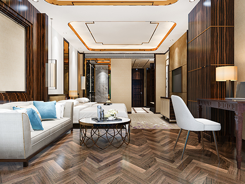
Power of Contrast: How to Use Bold Colors in Interior Design
When it comes to designing a beautiful space, color is everything. And while soft, neutral tones are timeless, there’s one design trick that never fails to turn heads: contrast.
Contrast in interior design is like adding a twist to a classic recipe — it makes things pop, adds personality, and brings energy to your space. Whether it’s black and white, blue and gold, or pink and green, contrasting colors can take your room from “meh” to “wow” in no time.
Contrast in interior design isn’t about being loud — it’s about being bold with intention. It lets your personality shine through and makes your space feel alive and exciting.
A2S Interior is here to help you strike the perfect color balance — stylish, soulful, and 100% you.
Why Contrast Works
Contrast creates balance and visual interest. It keeps your eyes moving around the room, helps highlight key pieces, and gives your space a clear identity. It’s not just about being dramatic — it’s about being intentional.
Top Ways to Use Contrast in Your Interiors
Light vs. Dark Walls
A classic move! Pairing a dark wall (like navy, charcoal, or forest green) with light-colored furniture instantly creates depth and drama. Reverse it with light walls and bold furniture for a more playful vibe.
Black & White Magic
Monochrome is a minimalist’s dream. Black and white contrast brings a clean, modern look that’s both timeless and chic. Add a pop of gold or wood for warmth!
Color Pop with Neutrals
Have a beige or grey room? Throw in a bright mustard chair or a teal rug. Bold accents against a neutral base make everything feel more vibrant without going overboard.
Bold Furniture on Soft Backgrounds
A bright red sofa against a pale wall? Yes, please. Contrasting furniture is a statement-maker that adds instant character to your space.
Warm vs. Cool Tones
Mix warm shades (like terracotta or rust) with cool tones (like mint or icy blue) for a fresh, lively contrast. This combo creates a welcoming and balanced energy.
Play with Patterns
Contrast isn’t just about colors — it’s about texture and prints too. Mix stripes with solids, or smooth leather with chunky knits to make your interiors feel layered and interesting.